Abodes - Lamentation for Emilio de’ Cavalieri, 2023, oil paint and acrylic on linen and wood, 27 x 35 x 6.5 cm.
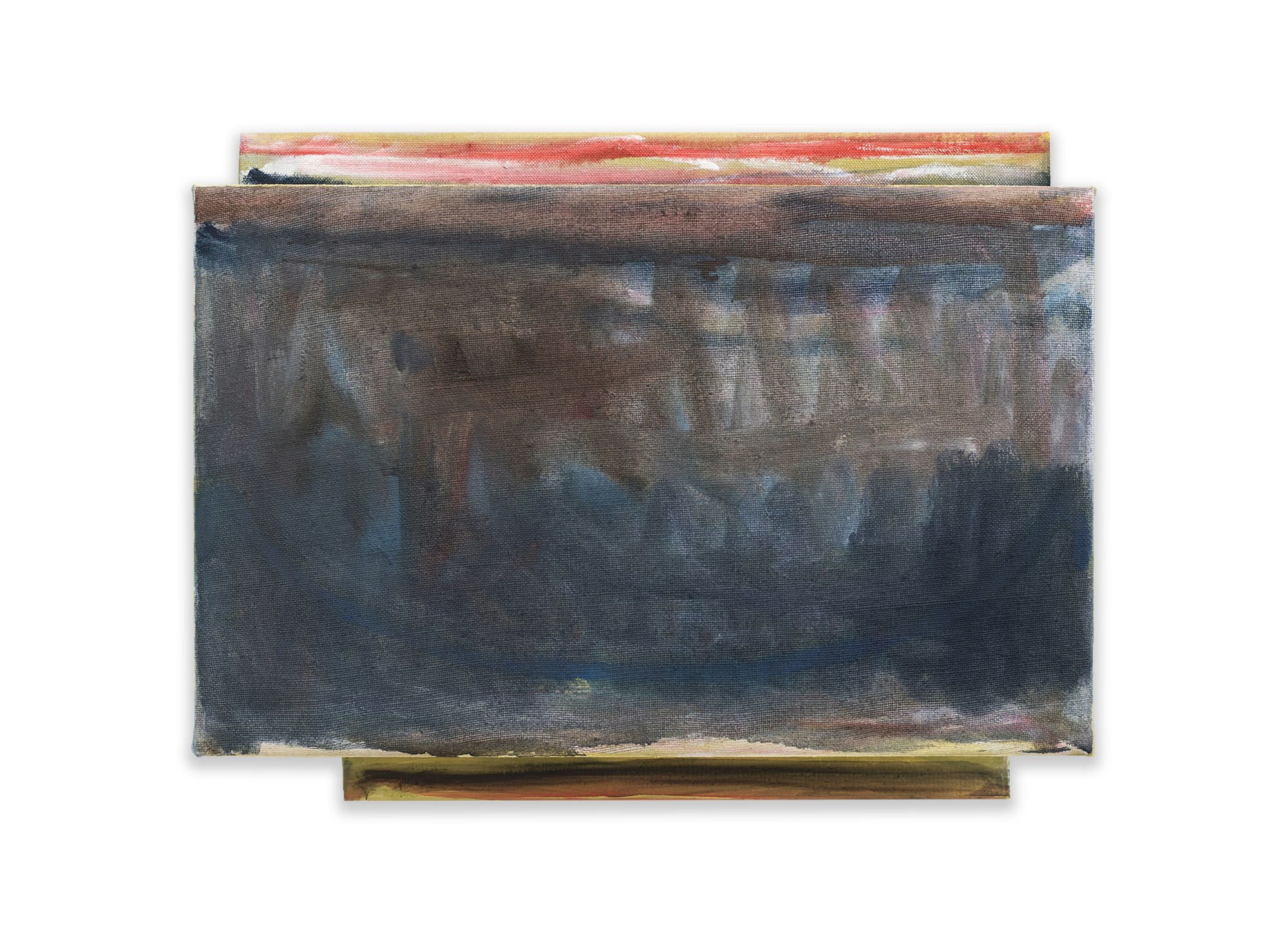
For this series of texts I thought it tempting to choose a painting that at first sight seems to be compact, uninviting and modest. A painting that can easily be overlooked when shown among more brutal and self-confident competitors. “Abodes - Lamentation for Emilio de’ Cavalieri” of 2023 is such a painting. It is unpretending, dark and small, not much bigger than the screen of my computer. But it is rich in texture, structure, and in spite of its gloomy appearance full of colour. Glimpses of reds, yellows and greens are shown at the top and bottom, browns and blues abound in the central part.
Notwithstanding its scant dimensions it has a lengthy title. Sometimes the title of an artwork provides a clue to the relation between the work and the reason why the artist has been inspired to create it. The title of this particular work, “Lamentation for Emilio de’ Cavalieri” gives us a clue that’s too interesting to ignore. Emilio de’ Cavalieri was a late 16th century Italian composer, who is most known for his work “The Lamentations of Jeremiah.” The little painting “Abodes - Lamentation for Emilio de’ Cavalieri” is likely made in praise of Cavalieri’s musical composition, or so at least it is suggested. Patrick Michael Fitzgerald’s lamentation in the form of a painting is about Cavalieri’s lamentation in the form of a choral. It is a lamentation of a lamentation, merging music and painting into one composition.
Where mediaeval music is monophonic with a single-line melody, Cavalieri’s music is more complex with multiple polyphonic melody lines. When the earlier mediaeval compositions can be compared with line drawings, Cavalieri’s compositions are closer to painting.
This painting is of course no plain translation of music into paint, but it captures mood, rhythm, and movement, which can be found in painting and music alike. The crossing and blending zig-zag brush strokes in the upper half of the painting suggest an intricate score of high and low chords. The upstrokes are light and transparent while the downstrokes are heavy and dark, moving from left to right, the way a musical score is read. The rich, dark and dense blues in the lower half of the painting are jotted down in ongoing swirling and circling movements, barely touching the underside of the painting, providing it with solidity and stability, as a basso continuo.
The two additions at the top and the bottom of the painting are putting it as it were in brackets, with reds, yellows and whites above, indicating a lighter and more ethereal mood, while the dark red and deep black below keeps us firmly linked to the ground. These two separate parts do not match. They are shifted in relation to each other, and they don’t have the same width either. The top section is wider, larger and lighter than the bottom part. The development of the painting is not just from left to right, but also from the bottom up. This provides it - notwithstanding its dark subject matter - with a certain lightness and positive attitude. Although this is not an immediately inviting painting, it seduces us as soon as we start contemplating it, and it will unfold itself before our eyes.
© Frank Lubbers, March, 2024.